
For over a century, the automotive industry was governed by the power of the icon. From the prestigious silver star of Mercedes-Benz to the prancing horse of Ferrari and the four rings of Audi, a simple, chrome-plated badge was all a vehicle needed to announce its pedigree. These symbols transcended language barriers and borders, serving as silent ambassadors of heritage, engineering prowess, and luxury.
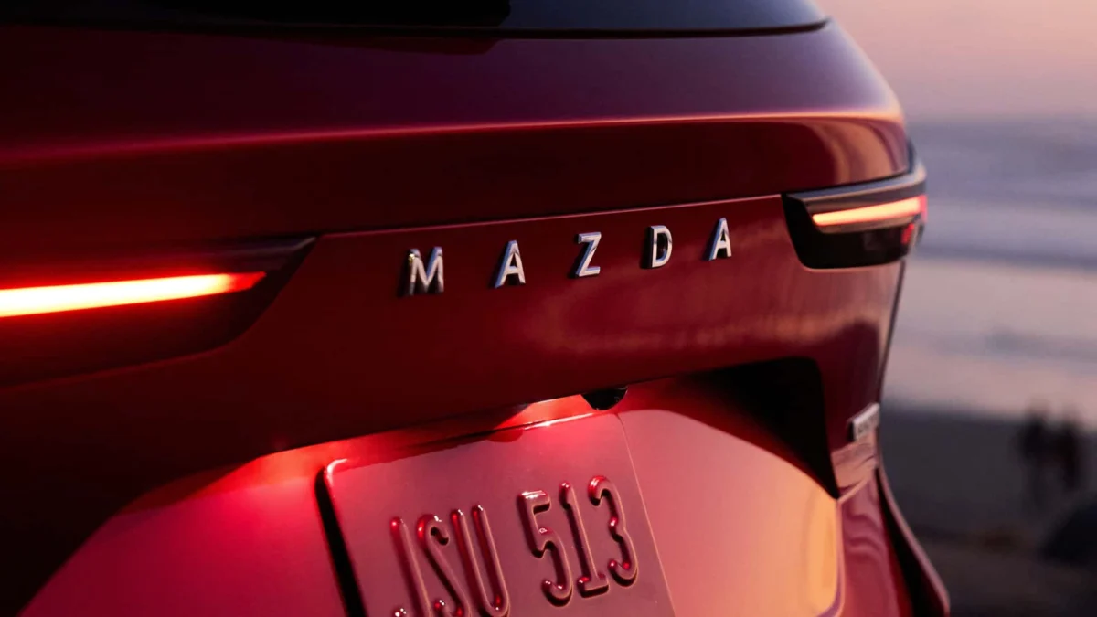
However, we are currently witnessing a seismic shift in automotive aesthetic language. A growing number of manufacturers—from volume-selling giants like Skoda and Mazda to premium marques like Porsche, Lancia, and Peugeot—are pivoting away from the solitary emblem in favor of bold, full-name lettering. This is not merely a passing fad or a minor stylistic update; it is a fundamental reconfiguration of how cars communicate identity in a digital, minimalist, and increasingly crowded global marketplace.
The Evolution of Identity: From Ornamentation to Architecture
Historically, badges were treated as jewelry. They were "hood ornaments" or refined medallions placed atop a grille or centered on a trunk lid, functioning as a decorative punctuation mark at the end of a vehicle’s design sentence. Today, that punctuation has been replaced by an entire paragraph.
This transition from logo to wordmark signifies a move toward "Modern Solid" design philosophies, as seen in the new European Skoda Elroq. By spelling out the brand name across the tailgate, designers are no longer treating the badge as an accessory. Instead, the lettering acts as a structural element that defines the visual weight of the rear fascia. By following the contours of the bodywork and aligning with horizontal light signatures, the brand name becomes an integrated component of the car’s overall architecture.
Chronology of the Shift
While the trend has accelerated in the last five years, it is rooted in a long-standing tradition of specific luxury brands.
- The Mid-20th Century: Porsche established the template early, utilizing the bold "PORSCHE" script across the rear light bars of the 911. At the time, this was a signature of prestige, an audacious statement of confidence that required no secondary symbol.
- The Late 20th Century: Volvo began utilizing wide-spaced, elegant typography on the rear of its estate cars, signaling a move toward Scandinavian minimalism.
- The 2010s: The rise of LED light bars provided a new "canvas" for designers. As rear lighting became a continuous horizontal element, designers found that a singular badge looked lonely or disconnected. The solution was to stretch the brand name across that width, creating a visual bridge between the taillights.
- The 2020s: With the surge of new EV brands—particularly from Asia—the need for immediate, unmistakable brand recognition became paramount. The "wordmark" became the industry standard for clarity and modernism.
The Design Implications: Why Typography Matters
The shift to full-name lettering provides designers with a versatile tool that a traditional emblem simply cannot offer. A logo is static; it occupies a fixed space and offers limited opportunity for geometric play. A word, however, is malleable. Designers can manipulate the kerning (spacing between letters), the weight of the typeface, and the material finish to dictate the "vibe" of the vehicle.
For instance, a brand targeting a younger, tech-focused demographic might opt for thin, sans-serif, widely spaced letters to suggest a futuristic, clean aesthetic. Conversely, a heritage brand might use a serif-inspired or bolder typeface to evoke a sense of tradition and permanence.
The Integration of Light
One of the most significant advancements in this trend is the electrification of the name itself. Peugeot, for example, has moved beyond simple chrome lettering to integrated, backlit wordmarks. By embedding the name into the rear light assembly, the typography becomes a functional part of the car’s lighting signature. When the brakes are applied or the lights are on, the brand name glows, ensuring that the identity of the car is visible at night from hundreds of feet away. This effectively turns the vehicle into a rolling billboard for the brand’s identity.
Beyond Marketing: The Logic of Minimalism
While critics might dismiss this as a branding exercise, the motivations are deeply rooted in the broader "clean surface" trend in modern automotive design. As aerodynamics become increasingly critical in the quest for electric vehicle range, designers are removing "clutter." Traditional badges, which often protrude from the surface, create microscopic aerodynamic drag and disrupt the flow of air.
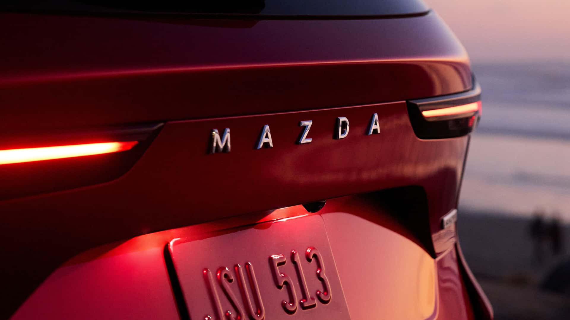
By utilizing flat, flush-mounted, or even recessed lettering, designers can maintain a sleek, uninterrupted surface. This minimalism is not just about aesthetics; it is about efficiency. The trend towards cleaner lines is a reaction to the overly complex, aggressive designs of the late 2000s and 2010s. By simplifying the visual information on the rear of the car to just the brand name, manufacturers are creating a sense of calm and sophistication that resonates with modern buyers.
The Global Perspective: Why Words Win
In a globalized automotive market, the "name" provides a universal advantage. When a vehicle is exported from a factory in Europe or South Korea to a market in the Middle East or North America, a symbol might be misunderstood or unrecognizable to a new consumer base. A written name, however, is unambiguous.
Furthermore, as the number of new automotive startups—many of them digital-native—continues to explode, these companies are eschewing the need for complex, metaphorical logos. They are opting for bold, legible typography that looks as good on a smartphone screen as it does on a piece of stamped steel. The brand name is now the logo, and the logo is the brand name. This reduces the cognitive load on the consumer: there is no need to learn what a specific abstract shape represents when the name is spelled out clearly.
The Future of the Traditional Badge
Does this mean the end of the iconic hood ornament or the chrome-plated medallion? Not entirely.
There remains a powerful sentimental and psychological attachment to traditional emblems, particularly among legacy luxury marques. A Rolls-Royce without the Spirit of Ecstasy or a Ferrari without the Cavallino Rampante would be unthinkable to enthusiasts. However, we are seeing a "dual-identity" strategy emerge. Many manufacturers are keeping their traditional logo on the hood or center of the grille, while using the full-name wordmark on the rear.
This hybrid approach allows brands to have their cake and eat it too: they retain the historical gravitas of their icon while adopting the modern, clean, and highly legible aesthetic of contemporary typography.
Conclusion: The New Language of the Road
The transition from symbols to words is emblematic of a broader shift in the automotive industry. We are moving from an era of "mechanical expression"—where cars were defined by their engines and aggressive styling—to an era of "digital identity."
In this new world, the car is an extension of the brand’s digital ecosystem. The typeface on the trunk is the same as the typeface on the company website, the app, and the marketing materials. It creates a seamless, cohesive experience that feels intentional and refined.
As we look toward the future of mobility, we can expect this trend to continue. Vehicles will become increasingly integrated with technology, and their designs will continue to prioritize clean, efficient, and highly legible forms. The badge may be changing its shape, but its purpose remains the same: to tell the world exactly who is driving by. And in the 2020s, there is no more direct way to do that than by simply spelling it out.