
A fresh coat of paint remains the single most effective "force multiplier" in residential interior design. For a fraction of the cost of a full-scale renovation, homeowners can fundamentally alter the atmosphere, light, and perceived value of their kitchen. While the technical process of painting is relatively straightforward, the psychology of color is a complex discipline. Choosing the right shade is not merely about aesthetic preference; it is a strategic decision that influences the marketability of a home and the daily experience of its occupants.
The Economics of Color: Why Paint Matters
In the current real estate landscape, the kitchen remains the primary focal point for prospective buyers. Industry data consistently indicates that kitchens and bathrooms are the two areas of a home that offer the highest return on investment (ROI) for pre-sale improvements. A kitchen that feels "dated" or "sterile" can act as a deterrent, while a space that feels "curated" or "custom" can command a premium.
Professional designers argue that color serves as the connective tissue between disparate elements like countertops, cabinetry, and hardware. A well-chosen hue can bridge the gap between budget-friendly materials and high-end aesthetics. Whether you are aiming to increase your property’s resale value or simply seeking to inject more intentionality into your living environment, the following 15 paint colors have been identified as top-tier choices for achieving an "expensive" look.
The Classics: Neutral Foundations
1. White: The Ultimate Blank Canvas
White is the perennial favorite for a reason. It is the architectural equivalent of a clean slate, allowing light to bounce off surfaces and creating the illusion of a larger, more airy space. The key to making white look expensive rather than clinical lies in the undertones. Crisp, cool whites provide a modern, minimalist edge, while warmer, creamier whites offer a sense of lived-in comfort. When paired with high-contrast elements—such as black iron hardware or rich, dark walnut wood—white becomes a sophisticated anchor that never goes out of style.
2. Beige: Refined Warmth
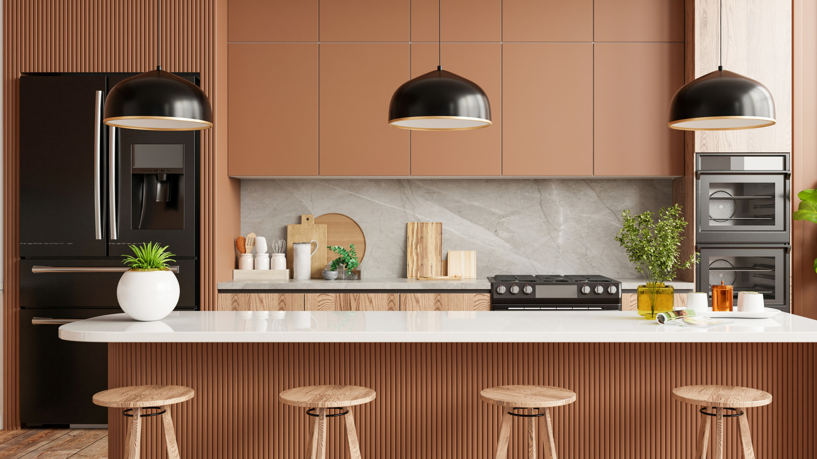
After a decade dominated by cool grays, beige has returned to the forefront of interior design, shedding its reputation for being "boring." Modern beige is nuanced, often leaning into "greige" or taupe territory. It adds an immediate layer of elegance to a kitchen, acting as a soft backdrop that pairs exquisitely with marble countertops and natural wood textures. Its practical advantage is also notable: it is far more forgiving of daily wear and tear than pure white, making it a functional choice for high-traffic culinary zones.
3. Clotted Cream: Soft Sophistication
Distinct from sterile white, "clotted cream" is a yellow-toned off-white that feels inherently inviting. This shade excels in kitchens that lean toward Scandinavian or English cottage aesthetics. It provides the softness necessary for rooms featuring rattan, unfinished oak, or natural stone. It is a color that feels "collected" rather than "installed," suggesting an effortless level of design maturity.
The Mood-Makers: Dark and Dramatic Tones
4. Navy Blue: The Timeless Anchor
Navy blue has transcended trends to become a modern classic. It serves as a visual anchor, particularly in kitchens that prioritize natural materials like wood and stone. Navy is an inherently regal color; when used on cabinetry or a central island, it creates a sense of depth and stability. Brushed gold or unlacquered brass hardware against a navy backdrop creates a luxurious contrast that feels plucked from a high-end design magazine.
5. Midnight Blue: Deep-Sea Luxury
For those who find navy too predictable, midnight blue offers a deeper, moodier alternative. This shade carries a sense of weight and substance, making it an excellent choice for large islands or lower cabinetry. It creates a "jewel box" effect that is often associated with bespoke, luxury kitchens. When paired with dark stone counters like soapstone or honed granite, midnight blue feels intentional, moody, and undeniably expensive.
6. Down Pipe: The Designer’s Charcoal
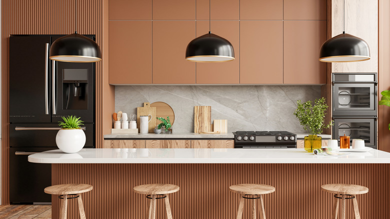
Farrow & Ball’s "Down Pipe" has become something of a holy grail in the interior design community. This deep, charcoal-gray is favored by top-tier designers for its ability to provide a dramatic, architectural contrast. It is a bold move that pays off by making hardware—specifically unlacquered brass or polished nickel—pop with remarkable clarity. It is the definitive choice for homeowners looking to make a statement that feels editorial and timeless.
7. Espresso: Sophisticated Depth
Inspired by the rich tones of Italian coffee, espresso is a powerful color choice that grounds a kitchen. It creates a high-end, boutique aesthetic that is rarely found in mass-market homes. Espresso works particularly well in spaces with natural light, where the depth of the color can be fully appreciated. It creates a dramatic backdrop for white marble, effectively highlighting the veining in the stone.
The Earthy Palette: Bringing the Outside In
8. Olive Green: The Value-Added Hue
Recent real estate studies have suggested that olive green is a high-value paint color that resonates with modern buyers. It taps into the biophilic design trend, bringing the comfort of nature indoors. Olive green is inherently rustic yet sophisticated, making it a perfect partner for Mediterranean-inspired decor, cast iron cookware, and dark wood accents. It feels grounded, considered, and calm.
9. Sage: The Calming Contender
While olive is deep and dramatic, sage is light and airy. It is a color that manages to be both "on-trend" and perpetually classic. Sage green is the ideal choice for those who want to add color to their kitchen without overwhelming the space. It pairs beautifully with cream-colored limestone, copper hardware, and open shelving, creating a serene environment that feels like a retreat rather than a utility room.
10. Warm Stone: The Bridge Between Worlds
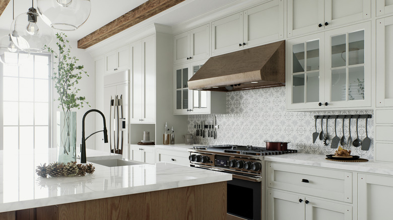
Warm stone is a nuanced, earthy neutral that sits perfectly between the coolness of gray and the warmth of beige. It mimics the appearance of natural limestone or slate. This is a sophisticated choice for those who want a kitchen that feels established and "of the earth." It is particularly effective in kitchens that utilize mixed materials, as it acts as a neutral bridge that prevents the room from feeling disjointed.
The Bold Statements: Personality and Flair
11. Burgundy: The Regal Retreat
Burgundy is currently seeing a significant resurgence. It transforms a kitchen from a functional space into an intimate, club-like atmosphere. It is a bold, "designer" choice that suggests a high level of confidence. Burgundy works best in kitchens with good lighting, where the depth of the pigment can shine. It pairs beautifully with brass, gold, or even sleek black accents, creating an environment where guests feel invited to linger long after the meal is finished.
12. Butter-Yellow: An Upbeat Classic
Butter-yellow is the antidote to the overly minimalist kitchen. It is an upbeat, cheerful color that ages gracefully. Unlike the harsh, bright yellows of the past, modern "butter" shades are softened with creamy undertones. They look spectacular when paired with black steel appliances or natural wood, creating a kitchen that feels warm, welcoming, and distinctly personal.
13. Hidden Sapphire: The Jewel Tone
Hidden Sapphire is a unique blue-green blend that brings a jewel-like quality to the kitchen. It is a vibrant, opulent choice that serves as an excellent focal point for an island or a pantry door. It pairs well with colorful accessories—such as Le Creuset cast iron or patterned tiles—making it a perfect choice for homeowners who want to inject their personality into the space without sacrificing elegance.
14. Plum: The Cozy Revitalizer
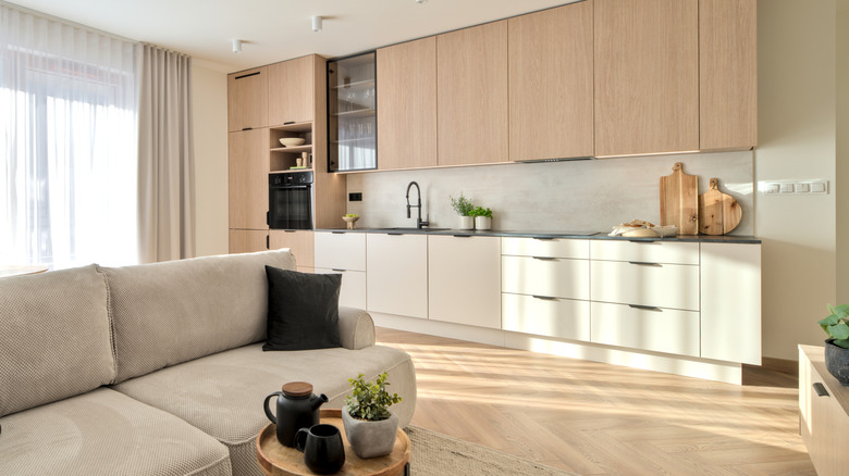
Plum is the dark-horse candidate for a high-end kitchen. It is inherently cozy and carries a sense of warmth that is often missing from modern kitchens. Whether leaning toward a dusty purple or a deep, dark berry, plum creates a luxurious, tactile environment. When paired with warm brass lighting, the space feels like a high-end lounge, signifying a bold and deliberate design choice.
15. Rich Honey: The Amber Glow
Rich honey is an amber-toned neutral that emphasizes the beauty of wood grains. It is a perfect choice for kitchens with high-quality cabinetry or floors. It brings a golden, sun-drenched glow to the room, creating an environment that feels welcoming and warm. When paired with matte black hardware, it feels modern; when paired with brass, it feels traditional and luxurious.
Implications for the Homeowner
The decision to paint is a low-risk, high-reward strategy. However, the true value is found in the selection process. Before committing to a color, homeowners should consider the following:
- Light Assessment: Observe how natural light enters the kitchen throughout the day. A dark color that looks stunning in a bright, sun-drenched kitchen may feel oppressive in a room with small windows.
- Material Compatibility: Always test samples against existing countertops, flooring, and backsplash tiles. The paint should enhance, not clash with, the permanent fixtures in the room.
- Hardware Synergy: Hardware is the "jewelry" of the kitchen. A high-end color requires hardware that complements its undertones.
- Finish Matters: For kitchens, the sheen of the paint is as important as the color. Semi-gloss or satin finishes are typically recommended for their durability and ease of cleaning in a high-moisture, high-grease environment.
By moving away from "safe" but uninspired choices and opting for colors that possess depth, warmth, and character, homeowners can effectively elevate their kitchens. These 15 colors are not just paint; they are tools for creating a space that feels curated, intentional, and significantly more valuable.